
Designer: Rygal Blaqk
Page 1 of 3 • 1, 2, 3 ![]()
![]()
 Designer: Rygal Blaqk
![]() Rygal Blaqk Mon Jan 11, 2010 11:49 am
Rygal Blaqk Mon Jan 11, 2010 11:49 am
Currently considering any requests .
Examples of designs:
Last edited by Rygal Blaqk on Mon Jan 11, 2010 2:42 pm; edited 6 times in total

Rygal Blaqk
![]()
![]()
Re: Designer: Rygal Blaqk
![]() Kevlar Mon Jan 11, 2010 12:55 pm
Kevlar Mon Jan 11, 2010 12:55 pm
But the banner underneth seems really dark, I can't really see whats in the box, maybe fiddle with your image contrasts?
Kevlar
![]()
![]()
Re: Designer: Rygal Blaqk
![]() Rygal Blaqk Mon Jan 11, 2010 1:09 pm
Rygal Blaqk Mon Jan 11, 2010 1:09 pm
Kevlar wrote:I like the multi-layered OUF symbol. =D
But the banner underneth seems really dark, I can't really see whats in the box, maybe fiddle with your image contrasts?
Yep, Fiddling with it now. Doesn't help that I'm doing it in a dark room.

Rygal Blaqk
![]()
![]()
Re: Designer: Rygal Blaqk
![]() Kevlar Mon Jan 11, 2010 1:19 pm
Kevlar Mon Jan 11, 2010 1:19 pm
Rygal Blaqk wrote:Kevlar wrote:I like the multi-layered OUF symbol. =D
But the banner underneth seems really dark, I can't really see whats in the box, maybe fiddle with your image contrasts?
Yep, Fiddling with it now. Doesn't help that I'm doing it in a dark room.
If its brighter and more sharper, cleaner lines, it would be perfect for the title image at the top of the forums.
Kevlar
![]()
![]()
Re: Designer: Rygal Blaqk
![]() Rygal Blaqk Mon Jan 11, 2010 1:58 pm
Rygal Blaqk Mon Jan 11, 2010 1:58 pm
The color of the background is the same as the background up the top..
Rygal Blaqk
![]()
![]()
Re: Designer: Rygal Blaqk
![]() Benson Mon Jan 11, 2010 2:39 pm
Benson Mon Jan 11, 2010 2:39 pm
If you make it smaller dousn't that improve the look?
haha yes, bit a noob at this stuff...

Benson
![]()
![]()
Re: Designer: Rygal Blaqk
![]() Rygal Blaqk Mon Jan 11, 2010 2:45 pm
Rygal Blaqk Mon Jan 11, 2010 2:45 pm
Benson wrote:How can I see the entire banner?
If you make it smaller dousn't that improve the look?
haha yes, bit a noob at this stuff...
Put a link below it so you can see it there.
Its currently at full size.
Didn't like my old 2009 one, was getting a bit ancient.
Rygal Blaqk
![]()
![]()
Re: Designer: Rygal Blaqk
![]() Jacan Na'al Mon Jan 11, 2010 3:40 pm
Jacan Na'al Mon Jan 11, 2010 3:40 pm
I too love the Republic logo laid over our OUF symbol.
Perhaps try some Aurebesh in there too?

Jacan Na'al
![]()
![]()
Re: Designer: Rygal Blaqk
![]() Rygal Blaqk Mon Jan 11, 2010 9:06 pm
Rygal Blaqk Mon Jan 11, 2010 9:06 pm
Jacan Na'al wrote:Needs to be more defined, it looks blurry atm.
I too love the Republic logo laid over our OUF symbol.
Perhaps try some Aurebesh in there too?
Tell me where it looks blurry..♠
Will add more pictures in between the 3.. so they all overlap each other.. fade into one another.
Already some aurabesh, for the title and the 3 word motto.
didnt want to make it too complicated....
Rygal Blaqk
![]()
![]()
Re: Designer: Rygal Blaqk
![]() Kevlar Tue Jan 12, 2010 12:15 am
Kevlar Tue Jan 12, 2010 12:15 am
I think it looks pretty good, but it is noticeably blurry in some areas.
Kevlar
![]()
![]()
Re: Designer: Rygal Blaqk
![]() Jacan Na'al Tue Jan 12, 2010 1:47 am
Jacan Na'al Tue Jan 12, 2010 1:47 am
I can see the Aurebesh now but only just, maybe make it slightly more pronounced.
Jacan Na'al
![]()
![]()
Re: Designer: Rygal Blaqk
![]() Rygal Blaqk Tue Jan 12, 2010 2:10 am
Rygal Blaqk Tue Jan 12, 2010 2:10 am
Will make aurabesh more visible.
Rygal Blaqk
![]()
![]()
Re: Designer: Rygal Blaqk
![]() Rygal Blaqk Tue Jan 12, 2010 3:10 am
Rygal Blaqk Tue Jan 12, 2010 3:10 am

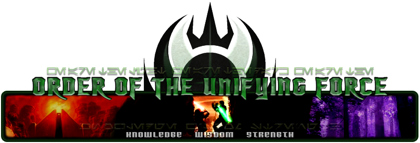
https://2img.net/h/i109.photobucket.com/albums/n78/pwnzealander/2010oufbannertake2_01.png
hows that?
Aurabesh reads:
we are the light we are the dark
we are the
Rygal Blaqk
![]()
![]()
Re: Designer: Rygal Blaqk
![]() Carlen Darko Tue Jan 12, 2010 6:40 am
Carlen Darko Tue Jan 12, 2010 6:40 am

Carlen Darko
![]()
![]()
Re: Designer: Rygal Blaqk
![]() Rygal Blaqk Tue Jan 12, 2010 7:19 am
Rygal Blaqk Tue Jan 12, 2010 7:19 am

Rygal Blaqk
![]()
![]()

Re: Designer: Rygal Blaqk
![]() Carlen Darko Tue Jan 12, 2010 7:40 am
Carlen Darko Tue Jan 12, 2010 7:40 am

Carlen Darko
![]()
![]()
Re: Designer: Rygal Blaqk
![]() Jacan Na'al Tue Jan 12, 2010 10:16 am
Jacan Na'al Tue Jan 12, 2010 10:16 am
Jacan Na'al
![]()
![]()
Re: Designer: Rygal Blaqk
![]() Rygal Blaqk Tue Jan 12, 2010 11:39 am
Rygal Blaqk Tue Jan 12, 2010 11:39 am
Jacan Na'al wrote:Font is much clearer, as is the new Aurebesh but you took away the 'Knowledge, Wisdom, Strength' Aurebesh.
-_-
I'll open it up now.
Rygal Blaqk
![]()
![]()
Re: Designer: Rygal Blaqk
![]() Jacan Na'al Tue Jan 12, 2010 11:46 am
Jacan Na'al Tue Jan 12, 2010 11:46 am
Maybe there is a function somewhere to create multiple themes that the users can select. I will research.
Jacan Na'al
![]()
![]()

Kevlar
![]()
![]()
Re: Designer: Rygal Blaqk
![]() Rygal Blaqk Tue Jan 12, 2010 12:32 pm
Rygal Blaqk Tue Jan 12, 2010 12:32 pm
Kevlar wrote:haha, poor rygal.
Hoops, flaming, jumping.
Now he wants buttons.. lol
Getting back into the Star Wars with this photoshopping, pulls me away from the constant raiding I'm doing..
Rygal Blaqk
![]()
![]()
Re: Designer: Rygal Blaqk
![]() Jacan Na'al Tue Jan 12, 2010 1:03 pm
Jacan Na'al Tue Jan 12, 2010 1:03 pm
You don't have to do them yourself but usually the one designer can match the style better.
Jacan Na'al
![]()
![]()
Page 1 of 3 • 1, 2, 3 ![]()
![]()


|
|
|